Control Pages
Control pages are graphical pages that you use to control Indigo, either through a web browser or Indigo Touch. Indigo has built-in control pages available on the web (Indigo Touch has built-in base functionality that matches them), and also allows you to design custom graphical pages - from the background image and/or color to the placement of text labels, control images, and what actions clicking/tapping on those images performs.
Control Page Editor
To create a new Control Page, select View->Control Pages, then click the New... button above the control page list. You will be shown the control page editor window:
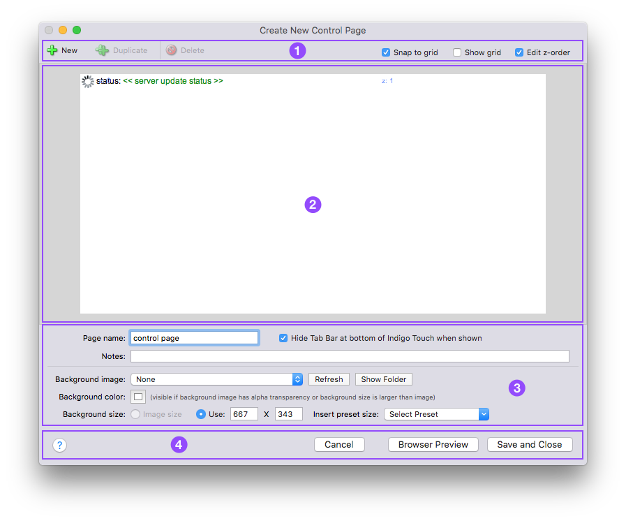
The editor window has 4 areas - the first is the the global control area. In this area you'll find buttons to create new page elements (labels, controls, etc), duplicate existing elements, delete elements, and turn on/off some features of the editor. Select Snap to grid to have page elements snap to a grid that overlays the design area (see the next item). Select Show grid to show the aforementioned grid. Select Edit z-order to show you the order of the page elements and allow you to change them. Higher numbered elements are drawn last, so if you have overlapping controls the one with the highest order will be drawn last.
The second area is the design area. This is where you'll graphically lay out your control page. It operates much like many drawing programs - you select objects and drag them around to position them. The default new control page contains two elements: a graphical server status icon and a server status text area. By the way, you can have only one of each of these element types on your control page.
The white area is the visible area that you'll see on the web page or in Indigo Touch. The gray area is just the image border area - items in the gray area will not show on the control page. If you have the Edit z-order checkbox described above checked, you'll see controls like this for each page element:
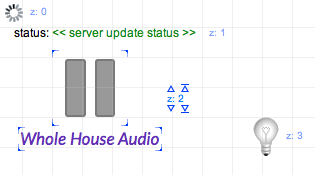
In the example above, you see 4 page elements: the graphical server status element, the server status text area, a device state element using a ceiling fan image, and another device state element using a lightbulb image. The ceiling fan element is selected, as you can tell by the blue brackets at each corner of the image. Because I also have the z-order checkbox selected, you see the z: # next to each element, and above and below that for the selected element you see up/down arrows, one with a line above/below and one without. The arrows that aren't pointing to lines will move the element up/down one step at a time. The arrows that point to lines will move the element to the top/bottom of the element hierarchy.
If you have a page element that's showing a textual description, then you'll notice a little resize icon at the lower left corner of the text - this control will allow you to adjust the width of the text field so that it can accommodate longer test. Text can only be a single line at the moment but you can make it as wide as the entire page.
The third area is the page element detail area. This area changes based on what's selected in the design area and what options are selected for the page element. If no page element is selected in the design area, then you'll see the information about the page itself:

This is where you set global information about the page itself. The Page Name: and Description: fields are pretty self-explanatory. Check the Hide Tab Bar at bottom of Indigo Touch when shown to have the bottom navigation bar hidden when this page is viewed in Indigo Touch. You can use a Background image: by selecting it from the popup, such as a floorplan or other image. You can add your own image by creating a PNG file and adding it to the backgrounds folder (to open that folder in the Finder just click the Show Folder button - and if you add an image while Indigo is running, click the Refresh button to have it added to the popup). Note: some versions of Indigo don't like spaces in the background image name so just replace spaces with another character such as an underscore.
If you aren't using a background image, your background image is smaller than the total size of the page, or if your background image has transparency identified, you can specify the color of the rest of the background by clicking on the Background color: colorwell. Finally, you can have the page size constrained to the size of the background image or you can specify your own page size. Here are a few design tips for designing pages for Indigo Touch on various devices:
- iPhone/iPod touch
- Viewable Portrait size: 320x416
- Viewable Landscape size: 480x268
- iPad
- Viewable Portrait size: 768x960
- Viewable Landscape size: 1024x704
If you look closely at the numbers, you'll see that on the iPad, the Indigo Touch header that's displayed above the control page is 64pix regardless of screen orientation. However, it appears that the header is decreased to 52px when in landscape mode on the iPhone/iPod touch. This is verified in both iOS 3.x and 4.x.
Page element details will vary based on what's displayed - we'll go into those details a bit later.
The final section is the bottom control area - the Help, Cancel, Browser Preview, and Save and Close buttons are also pretty self-explanatory (the Help button may have gotten you to this page in fact).
Other Editor Features
The Control Page editor now supports Cut/Copy/Paste between control pages as well as drag and drop. You can drag and drop page elements between pages and drop devices on a control page to add them. You can also drag control page elements to the Finder, which will create a clipping file. You can then switch databases, and drag those clipping files back onto a control page and it will import them. The clipping files will initially be titled with the XML text that's being exported, but you can change the name of the clipping file - so if you're sending it to someone else you can give it a more descriptive name. This is a good way to share groups of page elements with others.
The Control Page list in the Home Window will allow you to drag Control Pages out to the Finder. This will create a clipping file that can then be dragged back onto the Control Page list (for instance, in another database) and the whole control page will be recreated. Note, however, that if the target doesn't have the same devices, variables, action groups, and images, you'll need to edit the resulting page elements. The clipping files will initially be titled with the XML text that's being exported, but you can change the name of the clipping file - so if you're sending it to someone else you can give it a more descriptive name. This is a good way to share control pages with others. To import a control page, just drag it from the Finder to the Control Page list.
Page Element Details
As we stated above, each page element represents some kind of object - also called controls. Specifically, there 6 different types of controls.
Device State

When you select Device State from the Display: popup, you're shown a list of devices in the For: popup. Once you've selected a device, the next popup will show the list of states for that device.
The next row of options allow you to have the control represented by an image or in text. Images may be used to represent the state of most common devices - we provide quite a few different images. If you'd like to use custom images, check out the section below on creating and using custom images.
The next row of options is for the Caption: field - static text that can be used as a label for the control. It can be placed on any side of the control (left, right, above, below) as well as centered on top (good for buttons).
The next two options, [Client action:](#client-actions) and [Server action:](actions.md#server-actions) allow you to specify what happens when the control is interacted with (via click or tap) and are describe in separate sections below.
Variable Value

Variable Value controls have the exact same options as device state controls, but rather than use the device state it uses the value of the variable you selected in the For: popup to select the correct image or as the text to display.
Static Image/Caption

Static Image/Caption controls are simpler than the other controls: they can have an image and/or static text caption.
Refreshing Image URL

Refreshing Image URL controls allow you to specify a URL to an image that is refreshed periodically (specified in the Refresh rate: popup). Just specify the image size, URL, and refresh rate.
You can include markup that will do variable (%%v:VARIDHERE%%) and device state (%%d:DEVIDHERE:STATEIDHERE%%) substitutions as a part of a refreshing image URL. Note: file paths that contain spaces will need to have the spaces escaped with a backslash - /some\ path/that\ has/escaped\ spaces/. When you use substitutions in refreshing image URLs, you will receive a warning in the event log (when you edit the control page -- not each time the control page is displayed):
Warning (client) control page image URL contains a substitution: you will have to manually specify the image size for it to display correctly
As the warning suggests, you'll have to manually set the width and height of the control to match whatever the refreshing image will be after the substitution or the image will be distorted when it's displayed.
Server Status Text

This control will show the latest status update message from the server as text. You can have only one of these controls on your control page.
Server Status Icon

This control will show a spinning icon when the server is performing some request for the control page. You can have only one of these controls on your control page.
Client Actions
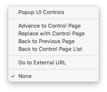
For every page element, you can have one of three client actions performed whenever the page element is clicked/touched:
Popup UI Controls- this will cause the client to pop up a dialog with the controls appropriate for the device or variable selected (it doesn't do anything for other page element types).Advance to Control Page- this will cause the client to display the selected control page. This version will leave bread crumbs so you can come back to the current page using the back button (a new browser window if theOpens new windowcheckbox is checked).Replace with Control Page- this will cause the client to display the selected control page. This version will replace the current page such that the back button won't go back to the current page (no bread crumbs).Back to Previous Page- this will cause the client to go back to the previous page. Useful if you want to create your own navigation.Back to Control Page List- this will cause the client to go back to the list of available control pages. Useful if you want to create your own navigation.Go to External URL- this will cause the client to open the provided URL in a browser window (a new browser window if theOpens new windowcheckbox is checked). In Indigo Touch, it will cause Mobile Safari to open and show the page specified by the URL.
Server Actions
Every page element may also have server actions performed - these are the typical actions described above. Just like Triggers and Schedules, you can specify a single action or multiple actions.
Show in Browser
In the main Control Pages view in the Indigo Client UI, you can select a Control Page and then click on Show in Browser to view the page in your default browser. Once that's done, you can take note of the URL in your browser's address field should you want to copy it and create a bookmark or other link to load the page directly in the future. The direct URL will look something like, http:*my_indigo_ip:8176/web/controlpage.html?id=123456789 where *123456789// is the Indigo ID of the page.
Custom Images on Control Pages
There are several sub-folders to add custom images to control pages inside:
Note Indigo 7 and earlier stores the images inside:
And also note that's the Library folder at the top level of your hard drive, not the one in your user directory. You'll find a couple of directories under there:
backgrounds- put images here that you want to use for control page backgroundscontrols- in this directory, there are 3 more:devices- in this directory, put in images to represent devices. In Indigo 4.1 and higher, we've added some heuristics that will allow you to add many more images. See Image Selection Heuristics below for details.static- in this directory, you can just put static images that are shown when you selectStatic Image / Captionfrom theDisplay:popup in the control page editor.variable- in this directory, you can put images that represent variables. In Indigo 4.1 and higher, we've added some heuristics that will allow you to add many more images. See Image Selection Heuristics below for details.
So, adding images is as simple as inserting them into the correct directory above based on what you want to use them for and restarting the Indigo Server. Images should be in the PNG format. When upgrading Indigo, v7 and above should automatically move over any custom images, but you may need to move them over manually if upgrading from an older version. Also, if you edit an existing custom image, you may need to restart the client (or clear the cache in Indigo Touch from the settings dialog) in order to see the changes.
Image Selection Heuristics
Before v4.1, we had a simple mechanism for selecting images based on values: for devices, you could have a file named MyDeviceImage.png, which would be shown if the device was OFF, and MyDeviceImage+on.png, which would be shown if the device was ON. Likewise, for variables, you could create an image called MyVariableImage.png, which would show when false, and MyVariableImage+true.png which would show when the variable value was true.
We've expanded the image selection criteria so that it can find much more interesting images based on values. To signify that an image should use these more complex image heuristics (described below), end the base file name with a "+": ImageName+.png. The "+" at the end is a hint to the Indigo Web Server and Indigo Touch that it may need to contact the server for the right image. The heuristic works like this now:
- Search for an image of the form
ImageName+VALUE.png, where VALUE is the current value. For ON/OFF type devices it will be on and off; just like before. For devices that have numerical state values (brightness, temperature, etc.) it will be the numerical value for that state. For variables, it's a bit different: it will be an exact match of the current value of the variable. So if your current variable value is "summer", then we'll look for an image namedImageName+summer.png. Spaces should work correctly as well, but other special characters may cause problems, so be careful as you plan specific values. If the variable value is empty then the base imageImageName+.pngwill be used. - If a match isn't found above, then Indigo attempts to find a numeric match in the following way: search for an image with a name that is the closest increment counting by 5. So, for instance, if the value of the device or variable is 13 (and there was no exact match to
ImageName+13.png), we'll look for an image namedImageName+15.png. If that isn't matched, we'll look for the next closest increment counting by ten (in this example,ImageName+10.pngsince 13 is closer to 10 than to 20). Next, we'll look for the next increment counting by 20 (ImageName+20.png). Finally, if that isn't matched, we'll look for the next increment by counting by 25 (ImageName+25.png). This will work for variables that are valid integers (whole numbers) as well. - If neither #1 nor #2 match, then the intention was to have the base image
ImageName+.pngdisplayed. (A bug in image selection in Indigo 5 and fixed in later versions however will result in no image. A workaround is to add an image namedImageName+true.pngwhich will be used in this case.)
Note that the dimensions of all the images with the same base image name must be the same. If they are not the layout of some of the images will be incorrect.
We think this will give you much more flexibility in displaying images that match your needs. This works for all control pages regardless of whether they're viewed in a web browser or in Indigo Touch.