Configuration Dialogs
The Indigo plugin XML contains some structures that are used in the various component XML files. Devices, Events, Actions, and the PluginConfig each may describe some type of user interface, so we needed a simple description language that described the user interface elements and layout. So, for the first 3, we created an XML element called a ConfigUI (we’ll discuss the PluginConfig a bit later). Here’s an example for a device:
<ConfigUI>
    <SupportURL>http://www.yourdomain.com/plugin/ApplianceModule.html</SupportURL>
    <Field id="autoLabel"
           type="label"
           visibleBindingId="manualEntry"
           visibleBindingValue="false">
        <Label>First, put your device into linking mode.</Label>
    </Field>
    <Field id="exampleButton"
           type="button"
           tooltip="Click this button to start the automatic discovery process."
           visibleBindingId="manualEntry"
           visibleBindingValue="false">
        <Label>Then click this button:</Label>
        <Title>Find Node ID</Title>
        <Action>validPythonMethodName</Action>
    </Field>
    <Field id="nodeID"
            type="textfield"
            readonly="YES"
            visibleBindingId="manualEntry"
            visibleBindingValue="false">
        <Label>Node ID:</Label>
    </Field>
    <Field id="simpleSeparator1" type="separator"/>
    <Field type="checkbox"
           id="manualEntry"
           defaultValue="false">
        <Label>Manually Enter Node ID:</Label>
        <Description>(Not Recommended)</Description>
    </Field>
    <Field id="manualNodeID"
           type="textfield"
           visibleBindingId="manualEntry"
           visibleBindingValue="true">
        <Label>Enter Node ID:</Label>
    </Field>
</ConfigUI>
The ConfigUI definition will result in the following dialog being presented to the user:
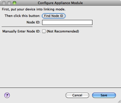
When each component type (device, event, action) needs a configuration user interface, and most will need some kind of configuration, it will have a ConfigUI element that describes the UI field elements along with a URL. When the user clicks on help button in the lower left corner (as shown above) their browser will be opened to the URL provided. If no URL is specified then the user will be directed to the main URL specified in the Info.plist file.
The rest of the elements in the ConfigUI represent fields that are shown in the dialog. We’ll go through each field type, starting with a screenshot of how it’s rendered, then the XML, and finally the details for each. The order in which you specify the fields is the order that they will show up in the dialog, and the id attribute is required for every field and must be unique within the dialog - it’s used to establish enabled and visible bindings between fields and more importantly it’s the key used in the dictionary to get the values when you get messages from the dialog (discussed more later). The id must be alphanumeric (and may contain underscores) and must begin with an alphabetic character.
You'll have the opportunity to validate the fields before they're saved (as well as know when the user cancels out of a dialog). How that's done is discussed at the end of this section.
ConfigUI Field Types
Each control you can place in a plugin configuration dialog:
- Button · Checkbox · Color Picker · Label · List · Popup Menu
- Separator · Serial Port · Text Field
- Dynamic Lists and Filters — runtime-populated menus and lists.
- Validation Methods — validating dialog input.
- Dialog Close Notification — reacting to dialog close.